

![Toddlers[1].jpg](https://images.squarespace-cdn.com/content/v1/5509a570e4b0a1f5a59f16d2/1458222746209-H070E2FND6OX1MZRSZ03/Toddlers%5B1%5D.jpg)






Enough about me. Let’s talk about you. What sets your brand apart? What supports that? What do your customers and clients want and need? What’s your brand voice? We’ve got to answer those “4 Whats” before I can conjure words and ideas that sing and sell. Reach out and let’s see what’s what. Speaking of what, what’s new? Take a look…
And a Duck shall lead them: Find out what happened when we created the smartest school mascot ever — an award-winning branding breakthrough — for Delta College.
Fresh Fruit: See my new, ever-so-slightly-whacked paid social creative for Welch’s, the big banana in fruit snacks. 2023 Communicator Award winner.
What’s in a name? Turns out, it can drive a brand. Get over to my page to view shiny new digital direct response ads for SnoopDrive. And step on it.
Smart Money: 60 seconds is time well spent to check out my new B2B social ad campaign for feisty fintech start-up Income Discovery.
Hat Trick: Sip and savor my highly caffeinated paid social for Eight O’Clock Coffee Company’s newest brand, Early Riser.
This social campaign won a Hermes Platinum, a MarCom Award, and an Award of Distinction from the Communicator Awards.
Long-form copy, content, demand generation, packaging copy, email, messaging and more in a wide range of segments? We’ve got those in back. Just ask.
Brochures, Online, Print Ads
and Social
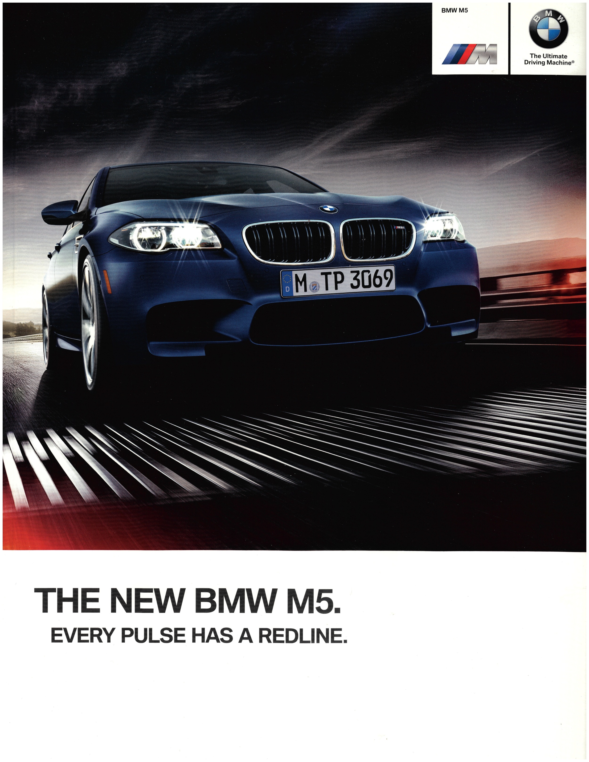
When it comes to copy voice, BMW looks for flair, passion and energy with an attitude.
Here are selected pages from three BMW product brochures: M5,
4 Series and iSeries.
M5 is BMW 5 Series’ high performance M configuration. Here are the brochure’s cover and five selected interior pages.
4 Series is the first in a new series of BMW two-door models. The trick was to emphasize significant differences between the new 4 Series and its 3 Series (four-door) cousin.
M2 is expressed and experienced in an interactive, multimedia digital brochure.
iSeries is BMW's all-new electric and hybrid brand. This brochure is the first effort to introduce this breakthrough model line’s technology to the U.S. market.
Beyond pages and cover concepts for brochures like these, I’ve written articles for BMW Magazine , BMW online advertising, and social for BMW North America and their sub-brand MINI.
Design Agency: RITTA Paramus NJ
Social Ads
Communicator Award Winner
Brand new social video campaign for Welch’s Fruit Snacks. We’re emphasizing fun with fruit. Because, uniike the competition, fruit is Welch’s first ingredient.
Appearing on Instagram and Facebook.
You can’t run. You can’t hide.
And they won’t be denied.
What’s your fruit I.Q.?
Cult Brand Strategy and Copywriting
2020 Hermes Creative Awards Platinum
Digital Ad Campaign
2020 MarCom Awards
Digital/Social
2020 Communicator Award of Distinction
Social
Shown Here: Ad Panels embedded in Facebook and Instagram pages. Second image is animated.
On Day One our team realized that Early Riser’s distinctively descriptive name gives our client an opportunity to uniquely own the early rising experience.
We’re deploying a combination of advertising art and copy, branding, and organic content — initially on social media — to create a community around, and an emotional connection to, the brand.
The brief is to balance telling the early risers’ story with advertising that dramatizes Early Riser Coffee’s significant price advantage over their key competitors — specifically Chock Full O’ Nuts, Folgers, and Maxwell House.
Facebook and Instagram are being utilized to build brand awareness along with a community of loyal Early Risers by integrating organic content, brand messaging, direct response, and retail sales promotion.
This 15-second video promotes Early Riser’s Amazon sales channel.
Brand Strategy
Brand Development
Character Co-Creation & Development
Copywriting
Art Direction, Branding & Design:
Jon Stapp atomicvibe design lab
2024 Educational Advertising Awards GOLD
Leanne Govitz, marketing director at Delta College, a top 15 ranked community college, had made the daring decision to change the school’s mascot from a pioneer to…a duck.
Leanne searched for a designer to realize her new mascot and came upon art director Jon Stapp of atomicvibe design lab. She loved his work and felt he was perfect for the job.
After Jon received her assignment, he called me aboard. Our reply to the client was a recommendation that, given her objectives in rebranding Delta, the duck needs to be more than just another ordinary sideline mascot cavorting in costume. (And completely different from the nationally famous duck at the University of Oregon.)
Reaching beyond obvious to original, Jon and I swung for the fences.
We created a fully formed character with a backstory that connects to and unites the entire Delta community – students, faculty and alumni.
As Delta’s Ambassador of Enthusiasm, Duck waddles beyond the usual athletics sideline role to take center stage in students’ everyday lives. The mission is encouraging high academic achievement for every Delta student.
Duck is the foundational brand asset of the school’s internal communications, merchandising, and external advertising -- a first for higher education marketing.
Jon did a brilliant job of creating and rendering Duck’s look and graphic assets, as well as developing concepts for character-themed merchandise. Partnering closely with Jon, my role was co-development of the character’s persona, brand and creative strategy, writing the Strategy section of the Brand Guidelines, Duck’s backstory, and copy for internal comms and external recruitment advertising.
It was all about making Duck smarter and more strategic than an ordinary mascot. Throughout our development of Duck (that’s the name, simply “Duck”) our mantra was, “the other mascots are idiots."
Here's the tag...
We’re all Ducks in this pond
Brand Strategy and Copywriting
Here are five print ads for Pitney Bowes' Document Messaging Technologies (DMT) business unit.
In the ad at left, the client (the leader in mail and customer messaging technologies) needed to get the conversation started for an innovative technology for which it would be introducing new products: intelligent mail. Here, I vectored the copy onto a provocative tack. And it got results. There were many requests for the ad's white paper offer.
The next three ads reintroduced Pitney Bowes docSense software technologies in the campaign I developed for them, "The Power Behind Documents."
The final ad is for Pitney Bowes' Mail Inserters, also from DMT, which are the industry standard in mail inserting equipment. So much so, they've spawned a fan base all their own.
Art Direction: David Grigg, Happy Dog Advertising
Shown here: four print ads
Brand Strategy/Development
Print Ads and P.O.P.
In our world of smart phones, video games and virtual reality, parents are concerned about their kids being able to function confidently in the real world of, well, real stuff.
Add to that growing worries over the safety of some imported toys and the future of American manufacturing and you have the perfect opportunity for a start-up like Luke's Toy Factory.
Shown here: two print ads
Art Direction by Mitch Achiron
mitchachiron.com
Social Media: Visual concepts and copywriting
LinkedIn ad campaign for Income Discovery, an app for financial advisors to help them plan their retiree clients’ retirement income spending.
When a client’s retirement income plan isn’t the safest plan, it’s the wrong plan.
That’s why Income Discovery pioneered Safe Pathˢᵐ. AI technology that constantly monitors and measures a client’s personalized income plan. In an instant, you and your client will know right from wrong to stay on the safest path. Or the exact course correction that’s needed.
Discover the rare feeling of being right all the time.
Lucky charms, rabbit feet, or crossed fingers not required.
Your client has retired. And an unexpected guest has crashed their party – taxes. What now?
When your client was working, taxes were predetermined and your options as an advisor were limited. The day they retire, your role changes to orchestrating their tax-optimal retirement income. You’ll need tools to help you time and source cash flows and disbursals to maximize their safe, post-tax spending.
With Income Discovery’s Income Planning 2.0 and Paycheck applications, those tools are in your kit.
Learn more about tax-optimal retirement income orchestration in an article from Income Discovery’s Chief Analytics Officer Stephan Granitz.
https://lnkd.in/ePyNsEJv
#retirementincomeplanning #PaycheckbyIncomeDiscovery
Individuality – it’s a fact of life. One that explains retirees’ low acceptance of pre-packaged in-plan retirement solutions.
In his article in InvestmentNews, Income Discovery CEO Manish Malhotra examines how retirement plans can better serve their retiring participants. It’s with a personalized, holistic solution like Paycheck in Retirement.
Seeking to retain your retired clients? This article is for you.
https://lnkd.in/epQJ5Kic
Brand Strategy and Copywriting
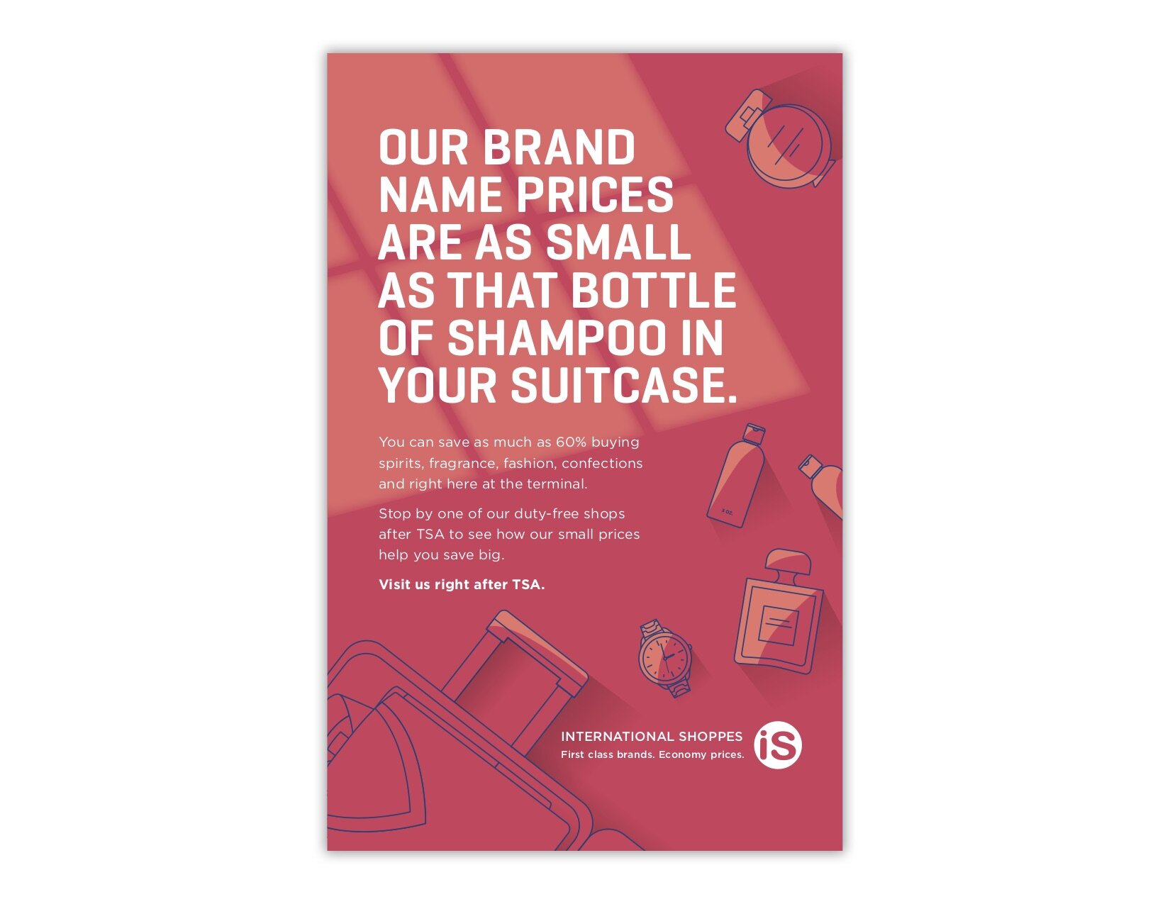
We’ve all seen, or perhaps have been to, those duty-free shops at the airports. Many of these stores are owned and operated by International Shoppes.
This poster series, which is on display in the TSA lines at many U.S. airports (see on-site installation below), encourages travelers to head straight over to an International Shoppes duty-free shop right after clearing through TSA.
Design Agency Partner:
Studio Rappy, New York
Fund Raising Brochure
Build a new children’s hospital in Haiti – wait, what? Isn’t Haiti a lawless nightmare? That may be true of southern Haiti, but in the north it’s a different story where for decades Hôpital SacréCœur has been expertly caring for its children.
Now that vital facility needs to be reimagined and rebuilt as a state-of-the-art medical center.
Thanks to fund raising and guidance from Haiti Health Promise, that vision of hope and health will soon become a reality.
I was privileged to team up with Barnett Design to tell their inspiring story in a fund-raising brochure. You see the cover here. To view the entire PDF, use the contact form and send me your address.
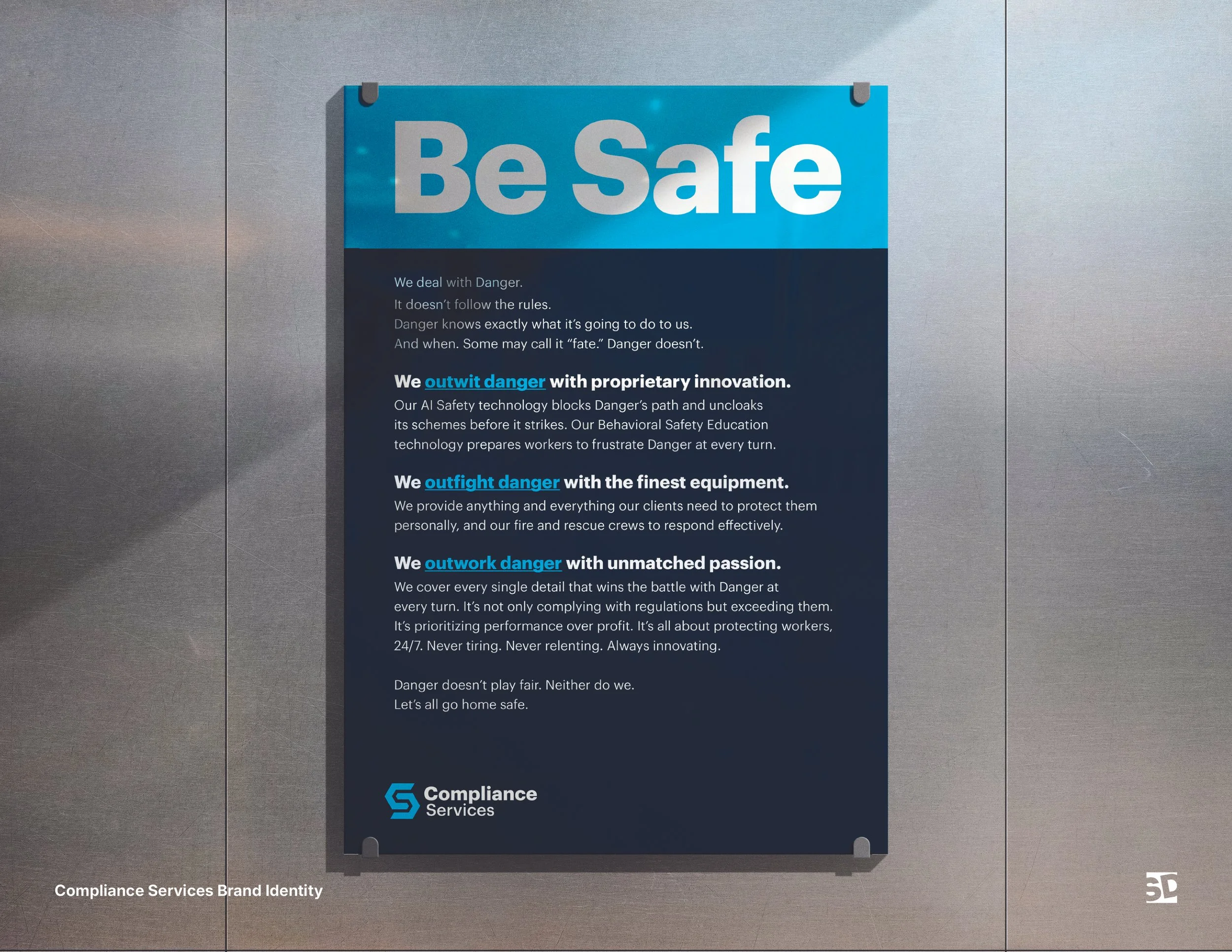
Compliance Services Brand Manifesto
This client is a leader and innovator in worksite safety services and solutions. This manifesto expresses the emotional core of the Compliance Services rebrand…
Be Safe
We deal with danger.
Danger doesn’t follow the rules.
Danger knows exactly what it’s going to do to us. And when.
Some may call it “fate.”
Danger doesn’t.
We outfight danger with the finest equipment
We provide anything and everything our clients need to protect them personally, and our fire and rescue crews to respond effectively.
We outwit danger with proprietary innovation
Our Smart Safety technology blocks Danger’s path and uncloaks its schemes before it strikes.
Our Behavioral Safety Education technology prepares workers to frustrate Danger at every turn.
We outwork danger with unmatched
passion
We cover every single detail that wins the war with Danger. It’s not only complying with regulations, but exceeding them. It’s prioritizing performance over profit. It’s all about protecting workers, 24/7. Never tiring. Never relenting. Always innovating.
Danger doesn’t play fair. Neither do we.
Let’s all go home safe.
Designer: Blake Stewart
Agency: Stewart Design
KEEP SCROLLING DOWN…
Brand Development & Copywriting
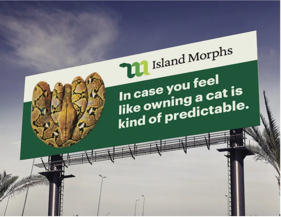
Fun project for a breeder of reticulated dwarf pythons. Esoteric? Yup. Nevertheless, it was all about creating and executing a new brand that would stand out and connect with a passionate audience.
Tag:
Dreams Hatched Here
Art Director:
Blake Stewart
Stewart Brand Design
Brochure, direct mail -- cover, inside overleaf, and spread
Of course, there are patriotic reasons for joining the Army Reserve. Among the others: there's one weekend every month that's guaranteed to be anything but boring.
Shown here, top to bottom: cover, inside overleaf and inside spread
Art direction by Steve O'Neill, NW Ayer
Bringing a bold new product/lifestyle brand to life.
Chase Motors was created to produce, in America, limited runs of custom redesigns of classic motorcycles — Chase Originals.
Beyond the bikes, it’s a 360-degree owner/member experience to include a Chase Original Bar and Restaurant, events, entertainment and more.
I worked closely with a creative team of Chase co-founder rock musician Andy Chase and graphic designer Patrick Seymour on this breakthrough motorcycle brand. As copywriter/strategist, I partnered with Andy and Patrick to develop a compelling, distinctive brand voice, including the “Chase Originals” brand name.
For a close-up view of body copy text, please access this section on your mobile device and expand.
Graphic Design Partner:
Patrick Seymour of Tsang Seymour NYC
Print Ad-insert
Hunger isn't an end in itself, but symptomatic of other conditions in people's lives.
Dimensional Direct Mail
IBM urgently needed to reach the CEOs of America's 30 biggest banks to tell them about an important new hardware/software solution, Netpay/MVS, which helps those banks attract and keep their largest customers: other banks.
OUTER COVER: The big one that got away...
INSIDE COVER: ...won't get away anymore.
An LL Bean fish net is inside, along with with brochures for the CEO to pass along to their bank's key decision makers.
Did it work? After this mailing dropped, the IBM sales team went from having exactly zero presentation meetings to 18.
Art direction by Jeff Bretl at Grey.
Brand Refresh and Brand Voice - Package Copy
Many of us remember Eight O’Clock Coffee as that coffee that mom had ground at the checkout counter. Today, Eight O’Clock, while still a premium coffee, needed a brand refresh and creative new flavors to appeal to new generations of coffee drinkers.
I provided a fun, new take on back panel package copy that’s a bold departure for the coffee category.
For the “Barista Blends” package copy, see the last two samples, below.
EOC Flavors of America Web:
https://www.eightoclock.com/coffee-varieties/flavors-of-america
EOC Barista Blends Web:
https://www.eightoclock.com/coffee-varieties/barista-blends
Shown here: six package back panels
Print Ad
This wealth management subsidiary of Franklin Templeton investments needed a complete refresh of their advertising to attract new, younger clients (parents in their 30s, early 40s). Here, concept and copy express the emotional reasons for successful wealth management from a company with more than 80 years experience in the field.
Agency: Soubriet Byrne & Associates
Copy guidelines, copy and tag line for a new merchandise brand
I co-developed advertising/marketing copy guidelines, wrote draft hang-tag copy, and created a brand tag line -- Venture Forth -- for this full line of active/adventure wear and accessories inspired by the adventurous spirit and programs of Discovery Channel.
Design by Tom Froberg of StyleWorks.
Online, Broadcast
and Brand Development
This client hosts online classes for colleges and universities. I created the branding and tag line: "Enter the E-Class," along with the brand's iconic button. This is a storyboard for an animated banner.
Hear my EVCI spot over on the Radio page on this site.
Art direction by Dick Thomas
Dimensional Direct Mail
Here's another example of using dimensional direct mail to seize the attention of senior executives. In this example, it's owners of $5 million-plus businesses. The challenge here was to be sure that the items inside were, in fact, made in Connecticut. Six BIC pens with black ink did the trick. And attracted businesses to the Nutmeg State.
Art direction by Don Carter.
If you're going to poach copy, poach from the best, I say! In this case it's from no less of a copywriter than Ben Franklin for this cardiovascular medicine practice in New Jersey.
Agency/Design Partner: Barnett
Dimensional Direct Mail
Caples Finalist Award
My toughest client? Bob Devol. That guy wants everything. He's a real pain in the ass. The good news is that he offers 100% share of the profits to his copywriter when a mailing succeeds, as this one did. So I guess he isn't that bad after all.
Art Direction: Barnett Design
Andy Awards Finalist
What if house pests could read? Well, no. But what if? This mailing was a big hit for America’s Number One pest control company.
Agency: JWT Direct
Art Director: Steve O’Neill
Direct Response Banners and Emails
Copywriting and
Brand/Creative Strategy
In the overcrowded extended auto warranty segment, SnoopDrive is both start-up and upstart.
Their unique actuarial model is configured to serve employees of select corporate partners. This prequalifies prospects to enjoy premium rates well below the competition, while providing BBB A+ service.
The client insisted on keeping their playful corporate name. My
take on this was that their name is an asset that can be leveraged into a unique CTA to drive prospects to not just get a quote, but to
Snoop a Quote.
I leveraged their name to create a call-to-action tagline:
Snoop first. Drive Smarter.
Seen here are a banner and a kick-off email.
The subject line for the email is:
It’s like an airbag for your budget.
Agency Partner: The Mixx
Art Director: Jonathan Aguilar